Mary TelariDigital Design Lead specializing in art direction and the design of scalable, mobile-first digital products.

| Condé Nast. The New Yorker Festival |
|
Website for The New Yorker Festival, a landmark event for the iconic American brand and a global reference in journalism and culture. Artists, actors, writers, politicians, and leading thinkers have gathered in New York for more than 25 years for a dynamic weekend of conversations, performances, and more, hosted by the magazine’s writers and editors. Year: 2024-2026 Company: Condé Nast Role in the project: Lead, UX/UI design — checkout flows and the reusable platform/frontend structure |
|

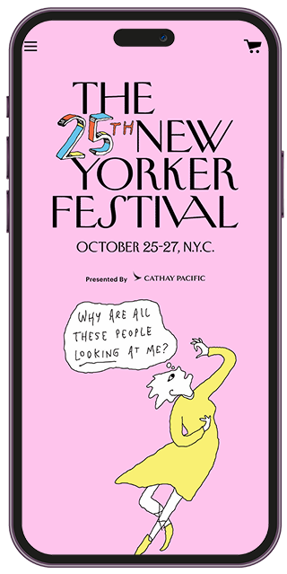
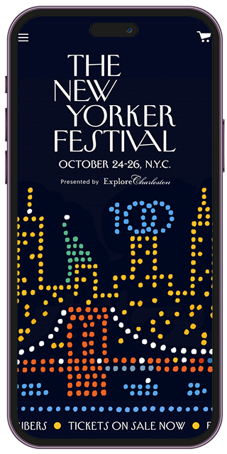
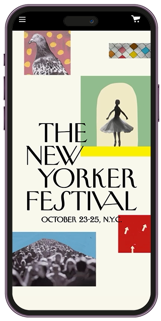
Promotion strategyThe project supports the event across multiple phases - from the initial announcement through ticket sales and up to the festival itself in October - adapting the UI to each specific goal. The homepage itself is modular, built from blocks that can be switched on or off and rearranged as needed — making the site as flexible as possible. By combining the strength of the brand with a thoughtful UX approach, we not only engaged our audience but also made the entire journey - from pre-event discovery to post-event video replays - effortless and intuitive. The audience response has been phenomenal. 
Mobile-first experienceOn small screens, navigation, schedules, and calls-to-action are prioritized so attendees can browse sessions and complete purchases on the go. Layout and typography scale to preserve readability without losing the New Yorker’s editorial character. Content hierarchy was carefully defined to decide what to surface first and what had to remain within the viewport at all times — such as a sticky checkout button anchored to the bottom of the screen — so the user journey felt just as fluid on mobile as on desktop. Checkout & ticket flowsThe checkout experience was designed to reduce friction across the entire purchase journey - from ticket selection and cart management to discounts, payment, and ticket delivery. Particular attention was given to simplifying flows and reducing cognitive load, especially for users purchasing multiple tickets within a single session. Clear progress indicators, validation states, and contextual feedback helped users stay oriented throughout the process, while a mobile-first UX approach ensured a seamless transition from editorial discovery to conversion. 

|
Watch the video |
Contact meGet in touch mary.telari@gmail.comDesigned and built by me using Cursor and Claude — no templates |